
Wine and Design: The Importance of the Label
- Alkam
- Mar 27
- 4 min read
Have you ever tried to think about what is the first element you notice in a bottle of wine?
Yes, perhaps the answer is obvious, however it is not always given the right importance: the label.
Deciding which bottle of wine to choose can often be a challenge for those who don’t know much about it.
In supermarkets, in specialized shops, on the shelves we find many bottles of wine, therefore the product must capture our attention, arouse our curiosity and be easy to remember.
In fact, most of us may not be so informed on this topic and when choosing a bottle of wine we will do so mainly based on the label.
It is undeniable that consumers buy with their eyes first , especially if they have to choose a bottle on a store shelf without the help of a sommelier.
According to a study by wine.it conducted on a sample of 2000 wine drinkers, 82% say that their decision is based mainly on the label.
Aside from the design component, however, it should also be remembered that in Italy there are regulations for wine labelling.
Being the label of a wine, its identity card, it must necessarily contain some true and demonstrable information established by law based on the type of product.
As regards wines, labels are regulated by European legislation, in particular by EEC regulation no. 1493/1999, subsequently amended in 2002, which outlines which fields on labels are mandatory and which are optional, as well as introducing their mandatory use.
In particular, the mandatory indications are:
Name of the given region
Classification
Name or business name of the bottler
Bottler's headquarters
Nominal volume
Actual alcoholic strength
Lot
Ecological indications
Vintage

Label and design
The design of the label therefore becomes a fundamental and strategic element to guide the choice of consumers , for example a label can influence the qualitative perception of the wine, making a wine appear more expensive or good than it is, or trigger the opposite effect, causing enormous damage to the image and sales for the various companies.
In such a saturated market, given the new trends that are taking hold, it is necessary to stand out from the competition , to capture the attention of the consumer, but also to tell a story and stimulate curiosity.
At this point the main question is, what should a label be like to influence the consumer?
Having very little space available and having to contain some information, each graphic element must be chosen very carefully to ensure maximum visual and emotional impact ; today's designs are courageous, they challenge traditional rules and metrics even if many historic wineries care a lot about the traditional aspect, continuing to guarantee a vintage look that transmits the quality of the product also thanks to very classic images and calligraphy.
On the contrary, the younger wineries have a modern and design approach, because since they are wines with limited visibility, it can be really unexpected and impactful , resulting in an excellent way to make a new wine known.
The Colors
Wine bottle colors generally involve pretty standard colors, so:
Red wines are often paired with deep, dark colors on light labels or rich, inky red, blue and gold colors on dark labels.
White wines vary in color from blue, green and yellow on light labels. For bubbles, gold or silver are used combined with soft colors such as pink.
Again, thanks to the use of colors, it is also possible to diversify a company's product range and therefore identify the production lines differently.
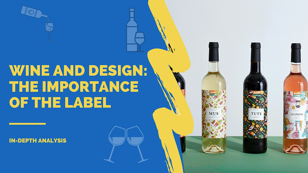
The images
The images give a truly unique design. It can summarize the distinctive signs of the company and the territory but at the same time you can totally divert the choice on a subject that captures attention becoming the protagonist .
Wines become true works of art , today, minimalism has aroused the interest of many producers. The message on the bottle is linear and clean, thanks also to elementary shapes and simple characters.
On the contrary, some brands prefer an abstract structure almost like contemporary art that stimulates a limited and exclusive perception of the brand , even using only and exclusively images.
Many producers also decide to rely on designer labels, commissioning the creation of the label to real artists who reflect the uniqueness of their product.
The Font
The use of typography in label design is a rapidly growing choice today, with some brands preferring labels that feature only custom fonts , such as handwritten or oversized fonts.
In relation to the classic trend, many brands prefer hot stamping with gold or silver foil and embossing that give an even more elegant look; touch is also a fundamental element: the materials chosen must be performing to adapt to different situations especially destinations.
Many wineries therefore choose to use embossed printing effects, offering the consumer a very pleasant tactile experience.
Some types of materials
The specific materials for labelling wine bottles represent a fundamental choice, an effective design will not have the desired effect if printed on an unsuitable material .
Over the years, Alkam has collaborated with several wineries, creating high-quality labels to dress wine bottles. In recent years, this sector has shifted towards a sustainable footprint .
For this reason we have decided to introduce several green materials , with a clear and precise message: respect and attention for the environment and for the future.
Research is the first important step, depending on the peculiarities of a product, retracing all the steps we have presented above.
From the moment of its production to the table, a bottle of wine and therefore its label passes through many hands and situations: they are cooled, wetted, heated.
When choosing the material and the printing method, take these small aspects into consideration.
Comments